I was checking out this article on WebDesignLedger.com called “40 Tasty Restaurant Websites to Inspire You” and two things immediately occurred to me.
- I was really really hungry looking at all the amazing food on these sites' home pages – great job on most of them to really highlight their food well in a very appetizing way!
- My marketing head kicked in. Fortunately, many of these guys do a great balance of graphic art (look of the site and displaying the food well) along side complementary marketing (making sure people can find the site and, find what they need and find their way around the site).
Previously, I had read a post on the Top Photographers' Websites article. Unlike the samples for the Top Restaurant Sites, it was obvious that the photographers' websites list was compiled by a designer who didn't look at the sites from a usability standpoint, but rather from an aesthetic one.
Though the photographers' sites had beautiful images, they didn't encourage people to take an action. You know, like contact the designer or purchase an image. Never mind things like calls to action and search engine optimization, the majority of those sites actually made it hard for people to get back to an image they liked. They probably were too focused on the images and believed that if their art was good enough, they didn't have to ‘market' the site.
Well, that is kind of true if:
- You are already a well established artist and a well branded name
- You are expecting people will know of you and come looking for you
- You are only sending folks to your site, not expecting new people to find you
This is not true if:
- You are trying to build brand recognition based on your new site
- You are building the site to have new people, who never heard of you before, find you through the search engines
- You are trying to get people to take an action, like call you or purchase something
Getting back to the restaurant sites, while I was reviewing these I got really hungry, so I went to lunch. A QA (Quality Assurance) and UI (User Interface) professional joined me and I told her what I was writing about.
She said to me, “The reason restaurants are more likely to accept marketing than photographers is because restaurants get that they have to get people in the door, to keep their doors open. Photographers are artists and want their sites to be a reflection of their art.”
At this point, I could easily turn this into a blog post about finding the balance between art as art and marketing an art website for a business, but let's save that for another blog post. However, there is relevance to what the QA/UI person said with relation to restaurant websites:
- What if the restaurant has a chef who thinks more on the lines of an artists?
- What if he/she thinks of his/her food as an artistic creation?
That's when they might forgo or forget about the purpose of their website and focus too much on the ‘food as art' design.
So many times, when I come across these Top Website lists, I come away thinking : “Well, the referenced sites are graphically lovely, but I don't think new people, landing on the site for the first time, know what to do or even what the site is about. And, they certainly aren't encouraged to go deeper into the site.” Often the visitor can't find their way around, even if they want to.
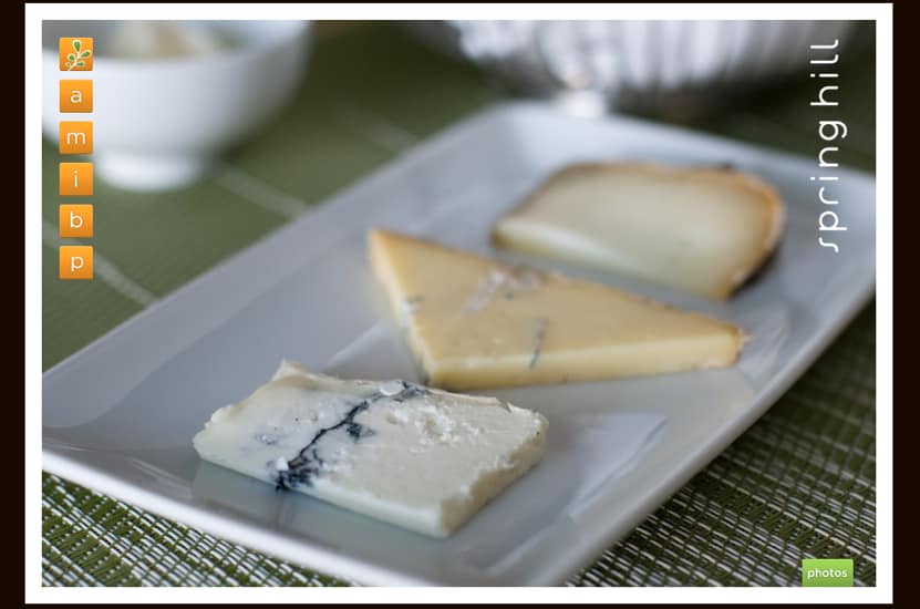
Using this 40 Tasteful Restaurant Website's article, here is an example of what I perceive to be a food as art designed site – either the chef or restaurant is world renown, or they didn't want to compromise with marketing/usability (or don't understand there needs to be a balance).
I'm guessing the chef/restaurant is the brand, or at least I am hoping for that, and they aren't concerned with new people searching the net to find them, because they are already a known brand. What do you think – tell me by commenting below?
The site is very pretty and very appetizing, but let's pretend a friend sent you an email with a link that stated: “Thought you'd like this…”
What is your first reaction (OK, your first reaction, if you like cheese as much as me is “YUM!” – but what comes after that?” Do you know what the site is about? Do you guess it's a restaurant, or are you thinking maybe it's a cheese manufacture? Do you know where to go next, to find out your questions? (HINT: Orange Letters – but which one takes you where?)
Now to be fair, this restaurant is not targeting everyone and not assuming people will just find them. Additionally, they do have some other images rotating on the home page, which make it clear it's a restaurant (if you look threw all the photos). And, this site, if they are banking more on reputation, may have intentionally been created this way. They are selective and probably only want the people who can afford and appreciate them, the type of person who is intentionally seeking them out – not the stumble uponers.
But stay with me another minute and let's get back to your pretend friend who sent you the link originally. Let's just say you guys are looking for ‘the experience' of this level of dining and your friend emails you, “Let's meet here for dinner…”
Though you guys are intentionally going to the site, is the site providing you with a good experience? Do you know where they are located? Do you know how to call for a reservation, do you need a reservation? Do they cater to your ‘special diet”? Can you look at the menu? Have you figured out yet, which orange letter will get you to the page to tell you the info you need?
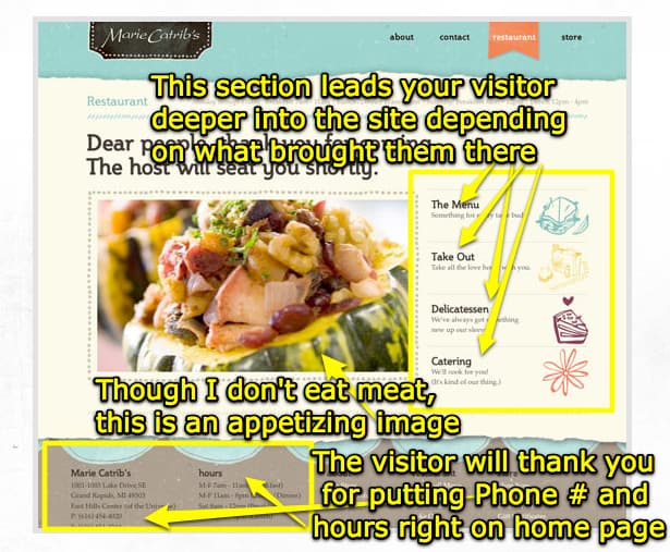
Now, let's look at a site that I think does a nice job of balancing graphic design and marketing/usability I've marked it up to show you what works (Stuff in yellow are my markups):
The graphic layout and the marketing components blend nicely & effectively together – underneath my markups, that is.
Now to be clear, I have to tell you two things:
1. I understand the audience for these two restaurants are different
2. If you click to this second site – MarieCatribs.com – this is actually not their home page!
However, you can see from my notes, why I think they are doing things correctly – for usability purposes, yet not loosing their creative aspect. If I had time to redesign the first example, to give you an idea of how – with a few minor changes – they could be both artistic and user-friendly, I would, but to tell you the truth, this post has gotten me too hungry. So why don't YOU tell me what you think the first website could do to make their site just a bit more friendly for the visitor, yet keep its creative vision… (comment below)
Bon Appetit and happy, balanced, web designing… (looking forward to hearing your ideas!)


OK, I will go first – a small thing that could be done without changing the look at all would be to keep those Orange letters, but add a rollover function so, when someone rolls over them they show the full word.
Then your visitors would know A was About and M was Menu – a lot easier – and still keep the look.
I’d also encourage them to put their phone # right on that home page.
There is definitely more… so now it is your turn. What do you think could be done, without effecting the original design too much?
Great article Bethany! It’s good to remember that “pretty does not always mean successful.” In this economy, no one can afford to ignore that (unless you are a Design student and you haven’t experienced reality yet)
~Judy
Yes, thanks Judy. The best option is to always try to balance design and usability! Thanks for the post!