Don't play hide and seek with your business.
If you have a website, it's critical that you show up well in a Google search, so new people can find your company/services/products.
Unfortunately, Google is changing how they rank websites in their mobile search results.
What does that mean?
If your site isn't considered mobile-friendly after April 21st of 2015, Google will place mobile optimized sites above yours.
Which means your competitor might raise in the rankings, while you fall.
So let's take a few steps now to stay visible for mobile search traffic!
If you're wondering”Is this REALLY important for MY site?” – the answer is: Yes!
And, before you ask, “Are people really looking for MY kind of business on a cell phone?” the answer is Yes!
Learn How Mobile Impacts My Own Business: UniqueThink caters to B2B, non-tech, small business owners looking to create their presence online.
This is not the audience you'd expect to do research on a mobile phone. You'd think they'd want to use a desktop computer to see samples of web and marketing projects.
Yet, on average about 13.39% of my traffic comes from mobile devices (6.44% more from tablets).
What does this matter to you?
If your average mobile traffic is close to mine, you'd be throwing away the chance to talk to over 133 potential mobile leads for every 1000 desktop visitors!
And that number is just going to continue to grow. If you are B2C or a brick and mortar location, the number is even higher. One of my clients is seeing over 42.81% mobile traffic.
1. What do you need to know?
Short Answer: Google Mobile Algorithm will negatively or positively effect every website.
Longer Answer: Beginning April 21st, 2015, if Google finds your site does not display well on a mobile device, you will see your rankings drop in Google’s Mobile Search Results.
If your site is built with Responsive Design, you could see a positive impact.
Responsive design makes your site scale appropriately for any device, so you could end up ranking better than someone who has an older site that isn't taking into account how it responds for mobile visitors.
Good News: If your site is either built with responsive design or uses a mobile-friendly plugin/tool, you might see better mobile search rankings.
2. How can you tell if mobile visitors can find your site?
Short Answer: Do a mobile-based search and look for the words Mobile-Friendly under your site address (url).
Longer Answer: Below are instructions and screenshots to show how to tell your site's standing with Google:
- Grab your cellphone – or someone else’s – and do a search to see if you come up with the Mobile-Friendly tag next to your domain name.
You must do this from a smartphone. If you do it from the desktop or a tablet, you won’t see this specific mobile-friendly tag that Google has been adding to search results.
Got the phone?
No?
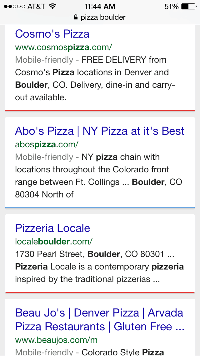
 OK, how about if I provide a screenshot of what I'm talking about? Let's try a Google search for Pizza Boulder.
What we are looking for is on the line under their url, next to each individual site's search result – it’s call the Mobile-friendly tag
Notice that the results for the #1 (Cosmo’s), #2 (Abo’s) and even the #4 position (Beau Jo’s) all have the words Mobile-friendly next to them in gray, but the #3 result for LocaleBoulder.com (Pizzeria Locale) does not. That’s because LocaleBoulder.com (not to pick on them) does not have their site optimized for viewing on a mobile device.
You may be thinking: “But I can see their site fine on my iPhone!”
If you are looking at this prior to the 21st of April you will still see this website listed high in the search results (and hopefully, they won't fall off too low later on).
And even if they never show up in a Google search, but you know their domain name, you can go directly to their site. It remains viewable on a mobile device.
In fact, to their credit, their site is prettier than the others mentioned. The problem is Google feels your ‘viewing experience' is negatively impacted, because they didn't design it with new best practices (like Responsive Design or at least with a mobile plugin/app).
3. So, what is it exactly Google is looking for – what makes a site Mobile-friendly?
Are you providing thumb-friendly buttons or, at least, spreading links far enough apart (so people don't accidentally click the wrong one)?
If it isn't easy to click on a link, it makes the site difficult to use.
You've been there, tried to click a link, but got the link next to it, because your thumb was too big for the space. Frustrating, right? That's what Google is trying to avoid.
What else?
How easy is it to read the site, specially for folks with tired ol' eyes? Is the text large enough, or are you just assuming people will pinch the screen to zoom in?
If you make it difficult to read your site, Google's gonna make it difficult for folks to find it.
4. How can you see what Google thinks of your site?
From a desktop computer, try this:
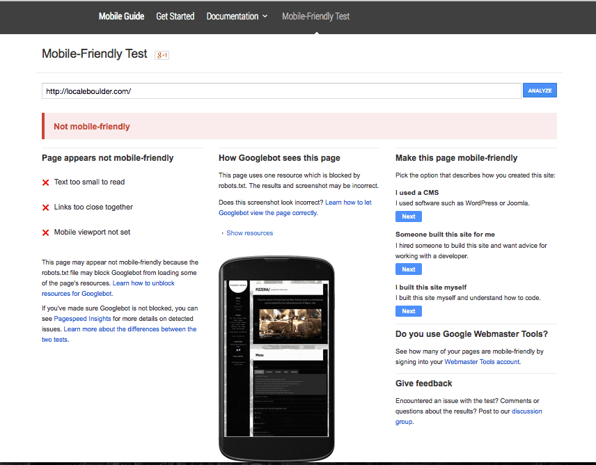
- Test Your site on the new Google Mobile-Friendly Testing Tool: https://www.google.com/webmasters/tools/mobile-friendly/
- Let's continue to use the pizza site as an example: localeboulder.com
You can do it with your own site, I'm just using this one to show you what to expect.
Good News: Google has provided this tool to tell us what it perceives as Mobile-Friendly. It gives results & fixes to sites that they find are not easy for mobile viewers to use.
Here are the results for this pizza shop's site as of the posting of this article:
- Page appears not mobile-friendly
- Text too small to read
- Links too close together
- Mobile viewport not set

Note: I have seen a few false readings on the new Google tool, so don't just rely on it.
Google's actually doing something unique and helpful. Not only are they showing you what is wrong, but the upcoming Google Mobile Algorithm works in real-time. This means if you make the changes, then let Google know, they will come back around and re-index your site.
So, if you read this post later on, you may find that LocaleBoulder.com has actually already made the necessary changes to their site. And, they may be ranking well again.
Does that mean they will show up in the same spot on the search for Pizza Boulder? To be clear, Google search results are always changing (and are also adjusted by sites you've looked at in the past – they seem to take your preference into account). But chances are if the site owner/developer makes the changes now – before the 21st of April, 2015, they can retain their good rankings!
Want to learn more about How to become Mobile Friendly – including a list of Responsive Design themes for WordPress? We've written an additional post all about it: https://uniquethink.com/how-to-become-mobile-friendly
What about you? Is your site mobile-friendly? Share what you've found in the comment section below. Or let me know what additional questions you might have.
